๐Ÿ“ž 416-838-5150| โœ‰ [email protected]| ๐Ÿ’ฌ WhatsApp| Contact form โ†’
WEB DESIGN TRENDS 2026

Your site doesn't have to look like 2023

I look at a lot of websites for a living โ€” mostly other people's, mostly to fix something. And you can tell, almost instantly, when a site was built. Not because anything's broken. Just because design ages, the same way a haircut or a car dashboard does, and nobody notices it happening to their own site.

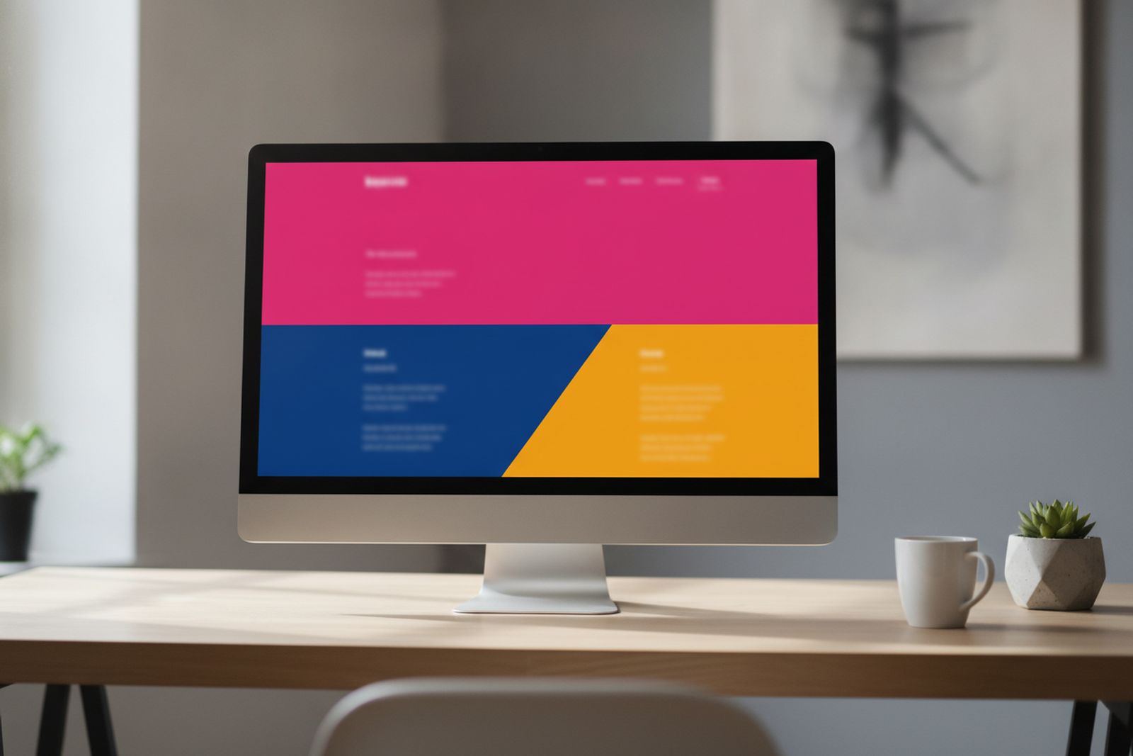
Modern web design workspace with a monitor showing a colorful website mockup ๐Ÿ“ท Drop photo in assets/images/blog/hero-web-design-trends-2026.jpg

Most "trend" lists are written by design agencies trying to sell you a rebrand, so I did the boring, useful thing instead: went through this year's trend reports from Wix, Webflow, Figma, Elementor and Vistaprint โ€” five outlets with pretty different audiences โ€” and looked for where they actually agreed.

A lot of it was noise (there is, I promise, a real trend report out there calling for "Kawaii glitter futurism," and no, we're not doing that to your association's membership portal). But five things showed up again and again, worded differently by each outlet, clearly describing the same shift. Here's the list, in the order I'd actually prioritize them for a small business or association site.
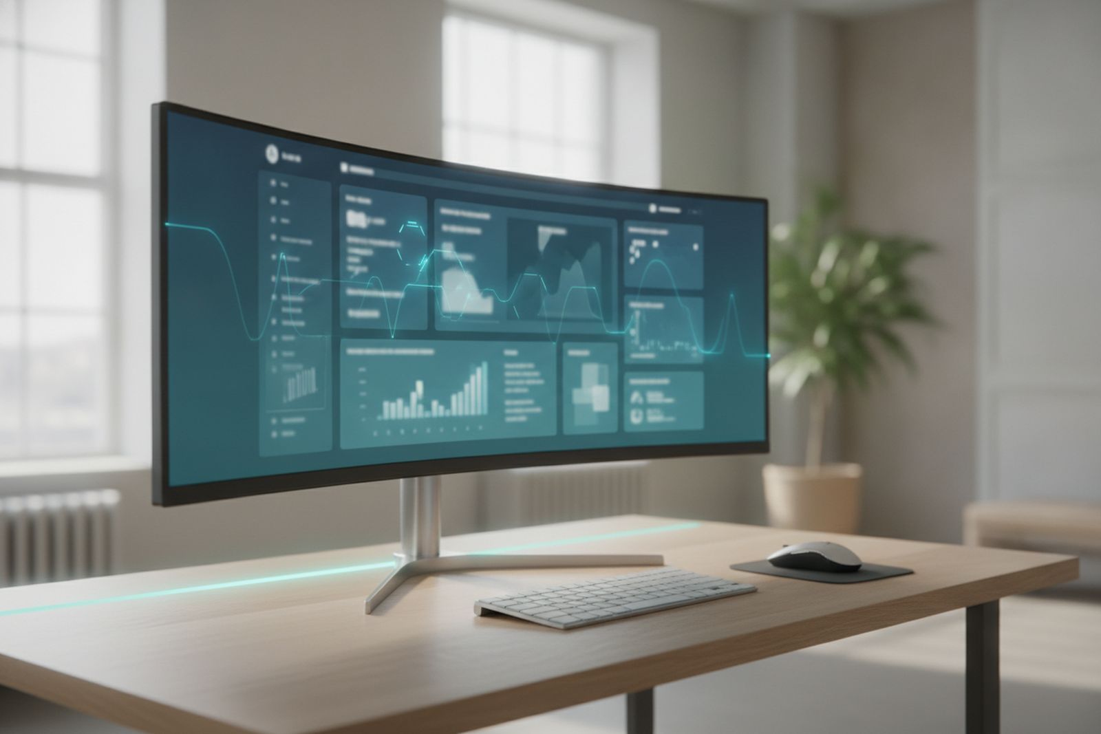
#1 Website interface showing an AI-personalized dashboard ๐Ÿ“ท Drop photo in assets/images/blog/webtrend-ai-personalization.jpg

Sites that adapt to the visitor, not the other way around

Elementor calls it the "Agentic Web," Vistaprint calls it "AI-Powered Personalization" โ€” same idea

Instead of one static homepage everyone sees, the layout, the offer, and even the copy shift based on who's looking and what they've done before โ€” returning visitor vs. new one, mobile vs. desktop, someone who's already read your pricing page.

Worth it if: you sell more than one thing, or your visitors clearly fall into a few different groups

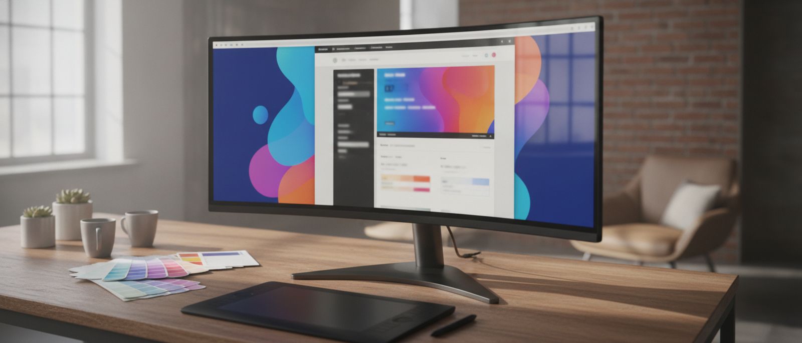
#2 Website mockup with bold, saturated color-block sections ๐Ÿ“ท Drop photo in assets/images/blog/webtrend-bold-color.jpg

Whole color systems, not one shy accent color

Wix's "Dopamine Colors," Webflow's "Explosion of Color," Figma's "Vibrant Palettes"

The safe, one-blue-accent-on-white look is quietly dying. What's replacing it isn't chaos โ€” it's confident, deliberate color used throughout a page, not just sprinkled on a button. It reads as a business that knows what it is.

Worth it if: your site currently looks like eleven other sites in your industry

#3 Website hero section with dramatically oversized bold typography ๐Ÿ“ท Drop photo in assets/images/blog/webtrend-bold-typography.jpg

Type so big it does the design's job for it

Wix's "Exaggerated Hierarchy," Figma's "Bold Typography," Webflow's "Dynamic Text"

Massive headlines, tiny supporting text, almost nothing else on the screen. It looks simple because it is โ€” and it forces you to actually decide what the one thing is you want a visitor to read first, instead of hedging with six equally-sized options.

Worth it if: your homepage currently tries to say everything at once

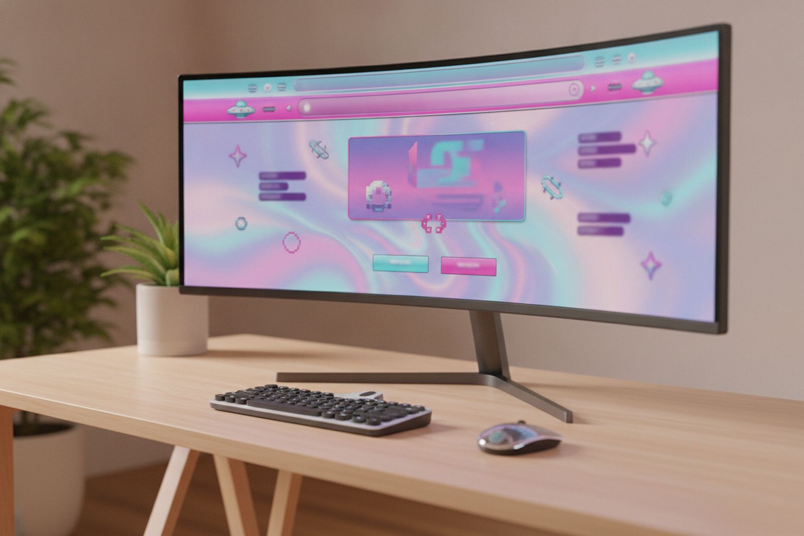
#4 Website with playful Y2K-inspired retro design and neon gradients ๐Ÿ“ท Drop photo in assets/images/blog/webtrend-y2k-retro.jpg

A little bit of Y2K, on purpose this time

Wix's "Dial-Up Design," Figma's "Retrofuturism," Vistaprint's "Dial-Up Delight"

Gradients, chrome text, pixel accents, the early-internet aesthetic everyone made fun of ten years ago โ€” deployed deliberately now, usually as a personality accent rather than the whole site. It signals a brand that doesn't take itself too seriously.

Worth it if: you're a consumer brand talking to a younger audience โ€” this one's a much harder sell for a law firm

#5 Clean, fast, accessible website interface with high-contrast readable typography ๐Ÿ“ท Drop photo in assets/images/blog/webtrend-performance-accessibility.jpg

Speed and accessibility, treated as design decisions

Elementor's "Performance-First Creativity" and "Accessibility-First Design," Figma's "Sustainable Web Design"

This is the one that won't get you compliments at a networking event, and it's the one I'd actually put first if I weren't ranking these by how exciting they sound. A site that loads fast on a phone with two bars, and that someone using a screen reader or a keyboard can actually navigate, is outperforming every trend on this list in the metric that pays your bills: people who don't leave. Every outlet I checked flagged this as a real, permanent shift โ€” not a fad, just an industry finally treating "boring" fundamentals as part of the design, not separate from it.

Worth it if: you have a pulse and a website. This one isn't optional.

If you only chase one of these, make it the last one โ€” a fast, accessible site is the trend that shows up in your analytics as fewer people bouncing, not just in a screenshot on a design blog. The rest are genuinely worth doing, but they're seasoning. Speed and accessibility are the meal. If you want a second opinion on which of these actually fit your site (and which would just be expensive noise), that's the kind of conversation CJR Digital Solutions has for a living.

SOURCES

Wondering if your site's due for a refresh?

CJR Digital Solutions builds and maintains WordPress and custom sites for small businesses and associations across Toronto and the GTA โ€” an honest look at what's actually worth updating, not a sales pitch for a full rebuild.